
2022-02-25
Camp management
News
In this day and age of ever-changing technological advancements the vast majority of institutions will opt to set up a website that will define their business practice and show their customers the wide range of services that they offer. Having a website is borderline mandatory(!) It has many obvious benefits, but the way they are delivered to the customer might incline the users to be either more enthusiastic, or less incited to choose you as their definitive choice, especially when faced with multiple options. Let us help you set some ground rules and help you build a perfect website for your campsite!
Website development has come a long way in the last two decades, from simplifying the code in which they are written in, ease of access to people with disabilities and even seeing the rise of sample editorial websites that help you design a website without the need of coding. Take for example: Wix, Bubble or Webflow.
All of these however have to be considered when building your page from the ground up, so what are the things you should be looking out for? Well let`s get the obvious ones out of the way first:
The Design
Naturally the first thing that comes to your mind when you think of a unique website would be the style thereof, nothing can express the identity of a camp more than a stylised website. A good example might be the inclusion of a banner with a full HD 4K aerial flythrough of the campsite showing off its facilities and surroundings by using a colour palette fitting for your intended purpose.
The meaning of colour coding?
Imagine yourself in an eco-camping, the word ECO is most commonly associated with the vivid green implicitly meaning care for nature. You might want to be explicit as well! If so, are you a lakeside camp with panoramic views of mountains and pastures? Consider using light blue and green combination. The same way a seaside camp with a beach would use yellow and blue to highlight their sandy beach and proximity to the deep blue sea. Of course if you have none of these options or if you just want a safe bet, you can always go the route by using the colours present in your logotype.
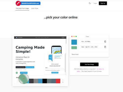
Regarding the fact of colours, when communicating with your designer or when searching for that perfect colour, you are probably looking to use a colour pie gradient, of which the most commonly used are Hex (Hexadecimal), RGB and HSL. Visit w3schools to get inspired!
There are also useful free websites that help you determine what colours are present within pictures or existing websites you are visiting by using the colour picker tool.
Try it for yourself on Imagecolorpicker.com by uploading your own image or pasting a website URL to get a full colour palette already in HEX & RGB codes.
Hero images
First things first, what are Hero images and why are they called that? In short, a hero image would be the first thing that your visitors are greeted with. It's definition is “an oversized banner image at the top of a website, oftentimes also called a Hero header”. In other words, that image will be the focal point of your homepage and the first impression your website will give off even before your guests start reading the content. Take for instance the website of the Camp Vransko Lake Crkvine with an excellent example. Notice the high-resolution pictures in the oversized banner showcasing everything the camp proudly stands for.
If you have visited the link, you might have also noticed that the images inside the banner are a slideshow, and that brings us to the next point:
Animations and interactivity
Animations are a double edged sword when it comes to websites. If they are done correctly, they can elevate your website to the point of uniqueness and individuality every website strives for nowadays. When the web is cluttered with millions upon millions of pages using the same layout, that uniqueness is exactly what your mark should be!. To be instantly recognisable means that your brand name succeeded and you are set apart from the others.
On the less positive note however, when executed poorly, animations can cause a whole lot of issues within a website. It may create unnecessary clutter beaming across the website with no logical sequence, sudden transitions and flashes that disrupt the user`s attempts at reading the content. Consider accessibility once again, not everyone that visits your website will perceive it as you will.
Are fancy animations a must then? Absolutely not. While they do add to the feel and originality, they are also notoriously difficult to pull off correctly, so unless you are very comfortable in using frontend development tools, there is no shame in abstaining from using very elaborate animation sequences.
Multimedia
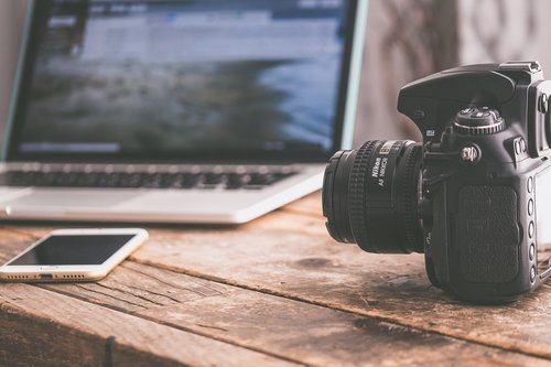
Finally, the design is defined by the multimedia content on your site. For guests to get a true feeling of what your campsite looks like you should definitely have a section dedicated to the gallery. The better the photos of your camp, the more inclined the guest will be to consider your campsite to be their best choice.
Make sure to include photos of:
- The reception: So that the clients know where to seek information when they first arrive
- Sanitary facilities: A very large amount of people judge the entire campsite by the condition of their sanitary block, make sure to capture the best photos possible.
- The pitches and mobile homes: Guests are most often worried about the state of affairs in which a pitch, mobile home or chalet finds itself in. A common worry is if the terrain is sloping, if so the campervan would have to consider bringing anti slip mats or a stabilizer. For mobile home rentals the concerns are mostly centred around the cleanliness, the bed and whether there is an ensuite toilet.
- Lastly don’t forget to include pictures of your prominent features, such as a pool, children`s playground, restaurant or beach it is after all the driving force behind distinguishing yours from other camps.
If you have a recording of all of those things you may be tempted to include it instead, but there are a number of reasons why you should refrain from doing that. You should by no means exclude that video, it is an excellent tool to give detailed insights into your campsite, but it serves a very different purpose from the gallery. While a video is a quick and dynamic way of introducing your camp, the gallery on the other side is a static collection of images that help the user pinpoint and analyse key features with precision. So the main argument is to keep both, the videos and the photo gallery, just make sure that the video does not exceed absurd lengths or contain excessive storage weight so as to cause your site to load slowly.
Content & Features
The content and Features are the meat and bones of your website. In reality, no amount of beautiful design and pretty photos will make a good website stand on its own, it needs to have textual content explicitly stating the features of your campsite. Content may vary however, depending on what you wish to highlight. Ponder for a moment what you would like to know first trying to inform yourself about an overnight stay? You would most likely want to know the location, capacity and unique features first, then after you are satisfied, you would most likely search for the pricing and more technical stuff. In the same way you should make a brief introductory sequence and then spread the information according to its relevance throughout your website in a format known as layering.
Layers
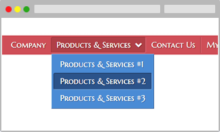
Layers let you divide your webpage into sections that can be formatted and positioned individually, they are most commonly used in a header navigation bar to facilitate the navigation of the website s massive amounts of information.
What information you are going to store inside each of these is up to you, but as a general rule of thumb the homepage always gives a short introduction and showcases some of your best photos, awards, reviews and similar.
The second tab should generally be the reason for creating the webpage, in this case "About the camp". All the particularities of the campsite should be presented here: the destination, the capacity, size, all the features you offer such as pool or restaurant, sanitary facilities, working hours, etc.
A quick access to the campgrounds map should also be readily available for the guests that are interested in the pitch displacement and general feel of the camp.
Of course the section is not only limited to this kind of information, it may be wise to include the history of the campsite and other interesting facts about the surrounding area.
It may be wise for larger campsites to create a separate section for the different accommodation types, where the pictures, price and specifics about the differences between each model are noted, such as with Camp Rehut.
If you have connections to the local sports & activities providers, you may dedicate a section to describe the services they are offering. For example: adrenaline parks, excursions, natural parks and similar. By promoting them, you are also getting traction in the search algorithm since your area gains further popularity and are even more likely to be referenced back by an external service provider.
Lastly, you should include your contact info and "About us" section. While providing users with a contact form is very practical, don’t omit the email address and telephone numbers as some clients prefer to contact campsites the old fashioned way, and just like the video and gallery situation, you have nothing to lose by keeping both. Aside from that, in this section can be included something like your views on camping, your motto, members of the staff and other, more personal things for anyone who wishes to get to know the campsite a bit better.

Closing argument
To sum up the thoughts behind this blog in a few words would be an advice to both those who already have a website, or are planning to make one. Keep in mind that the website you create will be closely associated to the image of your camp, its extension to be exact, visitors are either drawn towards or repelled at the very first sight of your website and, since in most cases, you won`t be updating it for a very long time, try to associate your camp with the best vision possible.
With the recent rise of Wordpress, Wix and other such sites, coding has never been easier to take up and learn, even if just the very basics. The skills you would eventually acquire are sure to benefit you a long way.
So, if you have ever been on the fence about whether you should update your website, there is no better time to start!